In the modern 20th century, technology plays a major role in every industry and how they operate their business and by creating efficiencies, save money, and provide better products and services to their consumers. Many industries nowadays tend to use AI, virtual augmented reality to offer consumers an enhanced customer experience. Some retail industries use a technology where the consumer can browse the products virtually and try them on before they make the purchase. This also can save money and time for both consumers and the retailer. This Interactive Retail Installation Project is a part of using the new technology and giving the consumer the best shopping experience. This is a great innovative idea for all the retailers to stand out among their competitors. This will boost their advertising campaign and give the consumers one of a kind experience.
This project works with any industry but mostly we focus on the retail industry. Specifically, this suits for stores with limited space where they struggle to keep up with the demand and consumer footfall, using the available space to provide the best shopping experience. This fits for indoor or outdoor stores. To achieve the best motion graphics, web coding, UX design, JavaScript will be used.

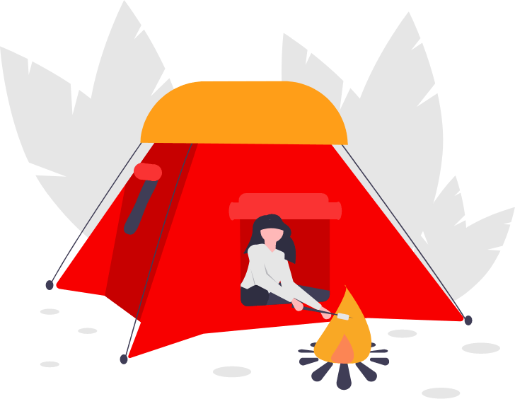
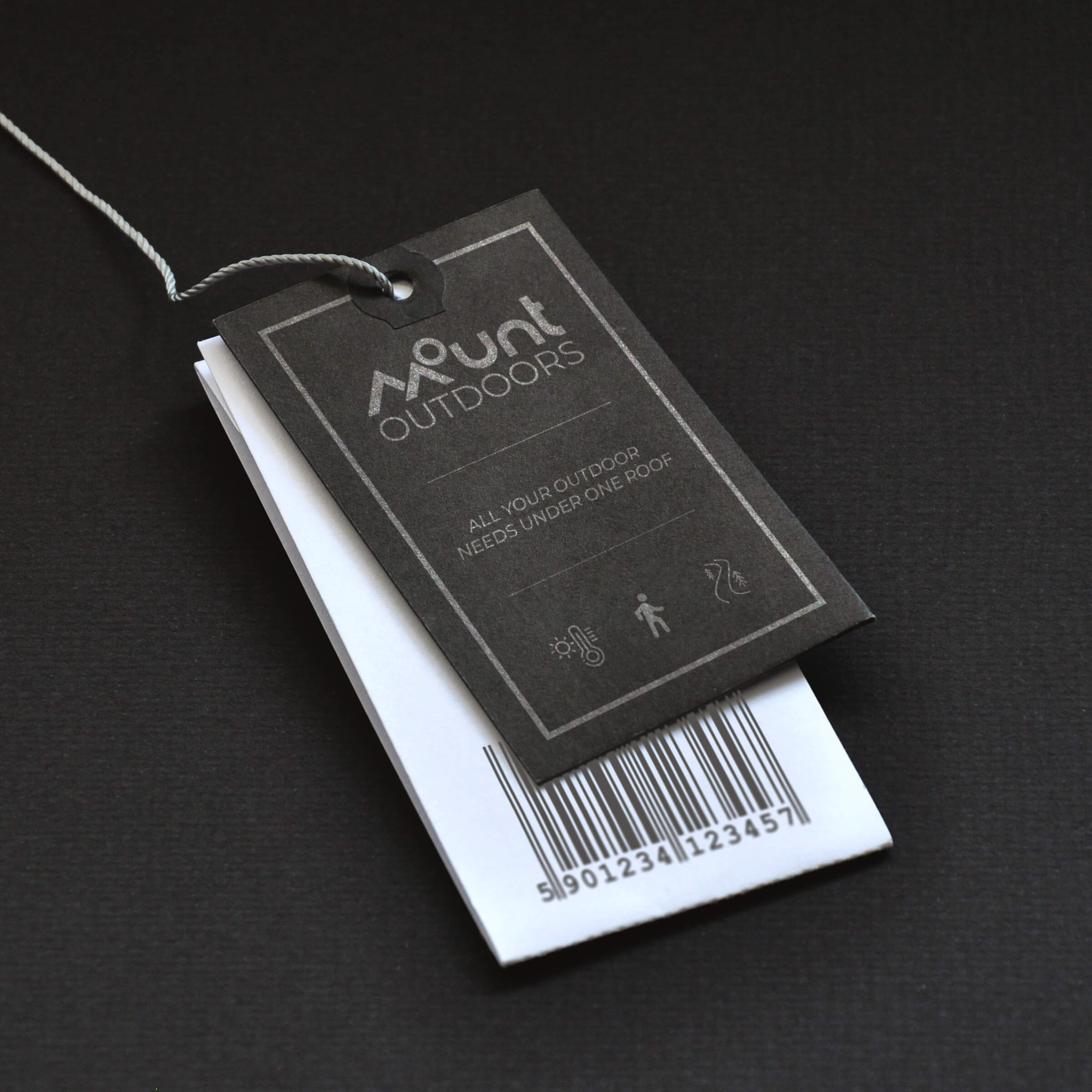
Mount Outdoors began in 2010, in Pickering, Ontario. Our roots were humble, and we've grown since then, but our vision is still clear: to provide the best outdoor gear and to be the best at doing it. We make sure to provide the best high-quality, high-performance equipment, gear, clothing, and apparel for people who wants to get outside plain and simple. This is about gear, grit, and connecting people to their passions.
We encourage and support thru-hikes who are end-to-end hikers seeking adventure along with long-distance, remote north-south hiking trails. Demographically, we are lucky to be operating in Ontario as southern Ontario consists of many hiking trails for people who ain't afraid to seek adventure and experience the beauty of mother nature. These are the individuals we identify as our primary customers.
We target young adults who love adventure and professionals aged between 20 to 35 in and around southern Ontario.
“We believe a life outdoors is a life well-lived.”
Technology plays a major role in every industry and how they operate their business. Businesses tend to adopt AI or virtual augmented reality as a pear of their product or service to offer consumers an enhanced customer experience. Focusing on retail businesses around the world, some use technology, where the consumer can browse the products virtually and try them on before they make the purchase.
The motive of this project was to use the design theories along with coding functionalities and explore ways the consumers could experience a new shopping era. The challenge was to keep this simple so it is easy to navigate and consumers don't get confused. On the other hand, I did not want this as a barrier to exploring new techniques.

A logo is the face and signature of the brand. It connects the brand to all forms of communication. The more consistent a logo looks and is used – the more likely it will be remembered and make an impact.
The logo is the touchstone of the brand and one of the most valuable assets.
I wanted to create a unique logo that looks creative yet simple. The logo should speak about the brand and its nature of business. This retail business only focuses on outdoor hiking clothing and accessories, therefore, wanted to bring the outdoor feel within the logo. After a few initial sketches and brainstorming, was able to create a creative logo that supports the brand strongly.
In order to maintain the brand throughout, created a brand book. The basic contents of this brand book will contain guidelines to the communication habits of the company but also making sure that the brand book has requirements for the basis of creativity and doesn’t act as a rulebook, or limit creativity.

To further have a clearer direction about the visuals of the project, I sketched some wireframes. This helped me to make a good looking design.
Once I was happy with the wireframes, I started to create the comps in photoshop. Keeping in mind the target audience of these apps has a wide range, therefore, I had to make sure to keep the interface clear and easy to understand. I also made sure that all 3 apps along with the video's do sync all together and flow flow schemaless.

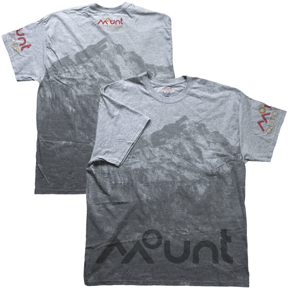
Typography is a key element to communicate a unified personality for Mount Outdoors. The word “MOUNT” is not a font and have been custom created specifically for the brand. I have selected “MONTSERRAT - REGULAR” as the font for the “OUTDOORS”. Montserrat will be used throughout this stations as a demonstration of its flexibility in layouts. You are welcomed to use any font style except “Italic and light” from the font family. The fonts selected has great legibility and readability. This should be the main font used on all print materials and web designs.
FRUTIGER 77 BLACK CONDENSED, always set in all caps will be the other typeface used in the brand as that helps to create a hierarchy in different materials. This font should exclusively be used only for taglines and marketing text designed for marketing materials, social media headlines and graphics, video, and other multimedia applications. Also, note that only Frutiger 77 Black Condensed is allowed to use and no other Frutiger font family or font style is acceptable.

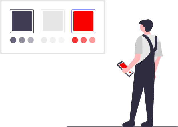
Our colors are what gives us our personality. We’re bold, colorful & confident. They’re simply loud & clear. Out base colour is Mount Wild Red and Mount Sunrise Orange as red represents activity, passion and orange represents sunshine, enjoyment and creativity.
● MOUNT WILD RED - symbolizes passion and strenght
● MOUNT SUNRISE ORANGE - symbolizes sunshine and freedom
I do understand that building a brand based on 2 colours is not practical at all times. Therefore, we have come up with supplemental colours that should only be used or applied for flat colour graphical elements, and or digitally colorize visuals in support of the brand.
● MOUNT SEA BLUE - symbolizes trust and loyalty
● MOUNT METAL GREY - used as neutrality and balance
The project consists of 4 stations including a promotional video section, where the user can experience a revolutionary shopping experience. In order to gain the full experience, I'd recommend the user to follow the below guide so they will never miss any part.
This Interactive Retail Installation Project is a part of using the new technology and giving the consumer the best shopping experience. This is a great innovative idea for all the retailers to stand out among their competitors. This will boost their advertising campaign and give the consumers one of a kind experience.
This project works with any industry but mostly I focus on the retail industry. Specifically, this suits for stores with limited space where they struggle to keep up with the demand and consumer footfall, using the available space to provide the best shopping experience. The project requires 3 large screens or monitors, 01 tiuch screen, 2 special mini mac's, and new technology such as gesture control's, control boards and sensors. This fits for indoor or outdoor stores. To achieve the best motion graphics, web coding, UX design, JavaScript has been used. Also, this programme will only run on Google Chrome web browsers. The touch screen app will run on its own software.
This is one of the main areas where the consumer will be able to interact with real products. The main purpose of this is to promote the key products by providing extra information and also suggesting other apparel or items that will match or suit with selected. This area is equipped with a large screen and an area to place a few products for the consumers to interact with. At the start the large screen will play a video with instructions on how to use the interactive catalogue, the main promotion of the 3 best-selling products with the name and the ptoduct image.
This teaser will prompt the consumer to walk towards the screen and interact with the products in front. The products are kept on a table approximately 2.5ft height. This table is equipped with a button, light and motion sensor and security cable to prevent consumers taking the sample display product. Once a consumer lifts a product from the table the sensor will then send the message to the system and the screen will display a collection of apparels with prices and names. If the consumer likes to know more specific details on the product, he/she picked up, they can press the button on the table which reveals more specific information about the product. If the consumer picks up 2 products at the same time the system will display an error message. The reason to create the error message is to stop displaying another product information without placing the previous and or let the staff know that the product is missing on the table.
Among the 4 stations, the rotating product station is the best and the most exciting. This station allows the consumer to interact with a specific product virtually, which means using a product and allowing the consumer to view the 360 and display the product specifications and the consumer can interact using their hand to rotate. Once the product is swiped left or right, it will stop at a point and highlight the product specifications. I have set 4 stop points for the moment, and highlight all the special specifications at the point. If the consumer wishes to know more about the product or images he/she place the hand over the sensor for 2 seconds and it will highlight the additional product details and or closeup images.
The station set up looks simple and only will consist of a large screen or display and a pedestal. The screens will display a screen saver or video with instruction on how to use the Leap Motion Tracker and view the 360 of the product and a product (using a backpack as for this project) with attractive background and tagline or promotion text. Once the consumer walks in front of the pedestal and wave his/her hand over the Leap Motion Tracker the screen will change to the product view and then the consumer will be able to swipe his/her hand to left or right to rotate the product in a circular motion. Once the product is swiped left or right, it will stop at a point and highlight the product specifications. If the consumer wishes to know more about the product he/she place the hand over the sensor and swipe forward, it will highlight the additional product details with closeup images. On the pedestal the sensor area will be marked with the instructions to make it easy for the consumers.
After one consumer leaves and there is no interaction, the system will play the screen saver or the video again till someone interact with the sensor.
This touch screen ordering station helps consumers save time and make a decision they will never regret. At this station, the consumers get an opportunity to visually experience and match few different outfits on a model. This system helps the consumers to match the best outfits as for their desire and place the order. The entire setup in this station is pretty much simple. A touch screen monitor along with a receipt printer will be placed and when a consumer places an order and walks to the pickup area with the printed receipt, the products will be packed and all the consumer will have to do is produce the receipt and collect his/her items.
The touch screen display will run a screen saver similar to a promotional video with images of a few products, and promotion items. At the bottom the text “touch to start” will be placed as an instruction, so the consumers will exactly know how to move to the next screen. Once there is interaction with the screen it will then animate to the main screen. At this screen he/she can swipe left or right to change different outfits and check how it looks on a real person. To make this happen I have used a male and female model images, with 3 different outfits and style to match the perfect experience. Consumer can toggle male or female, front or back easily on the screen. The price, name of the product and other details such as the material type will be displayed on the right, so the consumer knows exactly what he/she is ordering. Once they are satisfied with the order and want to proceed all they have to do is press the checkout icon at the bottom left. On the checkout screen consumers order will be displayed with the price, description and visual images, the consumer can choose the size and or the colour as they wish. The total amount of the purchase (a digital version of the bill) will be visible to the consumer on the right, and once the decision is finalised can place the order and print the customer copy receipt by pressing the print button. The printer next to the screen will then print the receipt and the consumer can take the receipt to the pickup station. This receipt will generate a unique barcode with the price and list of the order and the pickup station can scan the barcode to check the order.
If there is no interaction, the system will play the screen saver or the video again till someone interact with the sensor.
Motion graphics promotional videos will be used to communicate and create awareness to the consumers about the brand and products or even to create the atmosphere mindset of what the consumers can expect inside the store. These are clips not more than 1 minute long and loops continuously. This video includes the top-selling product or apparel to attract consumers. This large screen will be placed facing outside the store through the glass and by doing this not only the consumers knowing the brand but also people passing by will want to walk in to visit the store and check the products. This will increase brand awareness and increase the footfall of new consumers.
Advertising & promotion is the best way to communicate to the customers, and it helps inform the customers about the brand and the variety of products useful to them. Advertising is for everybody, from kids to elders, and plays a significant role in providing helpful information to consumers about the product or service offered, comparing features, benefits, and prices. With additional information, consumers often choose to purchase more products and services.
When creating Mount Outdoors promotional materials, I made sure not to deviate from the brand but also making it look attractive. I started with creating simple yet effective icons that explain situations, how those icons would look on tags, T-shirt design, gif web banners, and social media promotional videos.

Working on this project has made me learn more about the future industry needs and how to use the base knowledge and create amazing experiences.
● Planning & Content Creation
● Re-Branding & Marketing Materials Creation
● Video Filming & Editing
● Product Photography
● Motion Graphic Creation
To create the individual page layouts of eact station, I used Adobe Photoshop, and Indesign, Illustrator for creating the icons and the logo. The project was coded using HTML, CSS, and JS.
