Sandwich Factory is a mid-range restaurant that mainly focuses on sandwich varieties. The best and the most popular sandwich variety they sell would be the red curry egg sandwich. These sandwiches are very "British Empire" and have a certain air of the Raj. They are most appropriate for breakfast or even a quick, light supper. These sandwiches were so popular back in the days, whereas other countries tried to implement their flavors to add creative and amazing twists.
Sandwich Factory continues a family tradition of quality products, friendly service, and a huge selection of top-quality sandwiches, salads, soups, and many others. Drop by their store to buy a lovely spice gift basket for a loved one or try their daily featured meals.

Sandwich Factory was facing the main issue of people neglecting the most popular red curry egg sandwich which is known as the best egg sandwich. Even this dish was originated from the UK, Sri Lanka had added their twist into the sandwich and came up with a magical Lankan twist. Most might have tasted the classic egg sandwich, but this is the only place in North America where can you try the “Sri Lankan Egg Sandwich”.
Due to this reason, Sandwich Factory wanted to promote the red curry egg sandwich. The site needed to be modern and more user-friendly. They wanted to emphasize the history, what makes the sandwich special, and show a sneak peek of how to create the sandwich.
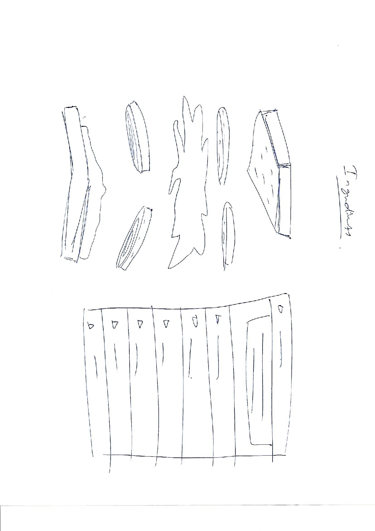
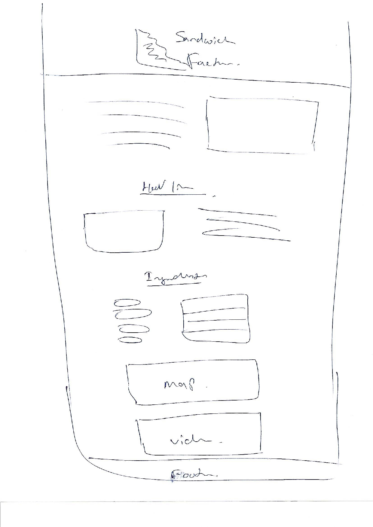
To further have a clearer direction about the visuals of the project, I sketched some wireframes. This helped me to make a good looking design.
Once I was happy with the wireframes, I started to create the comps in photoshop and InDesign. Keeping in mind the target audience of the website has a wide range, therefore, I had to make sure to keep the interface clear and easy to navigate.
The main typeface used in the project was Montserrat, a neat and smooth geometric sans-serif typeface that helps Sandwich Factory convey its values to the consumers. The font face is also efficient with a clean-cut look which makes it easy to read. Beautiful curves and well-rounded corners are suitable for both traditional, as well as modern websites. To create hierarchy and attraction, I have used bold and regular.

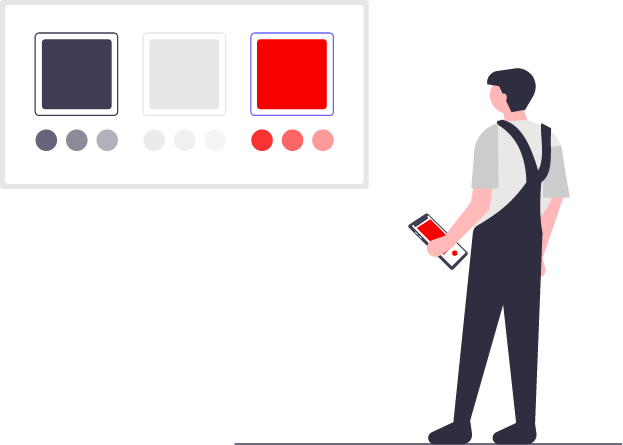
The colour choices were based on the values of the brand Sandwich Factory,
● Red - Enhances the appetite, energy boost, similarly, this happens when we are ready to feast and neurons fire up in the hypothalamus part of the brain. Also known to heighten nerve impulses and increase heart rate. This revs up people's appetites, making them hungry.
● Grey - for neutrality and balance.
To make the interface clean and easy for the eyes, I have included grey for fonts and white background. White indicates cleanliness, efficiency, and simplicity.
A single Web page that educates the history of the popular egg sandwich, how Sri Lanka had added their twist, shows a sneak peek of how to create the sandwich. The project offered the opportunity to plan and shoot a quick tasty-style video, create a responsive single-page website without using any frameworks, and use js, Jquery to animate vectors.
Working on this project has made me learn more about the usage of Jquery and js, plan and shoot tasty-style videos with limited resources.
● Web Design & Development
● Video Filming & Editing
● Illustration
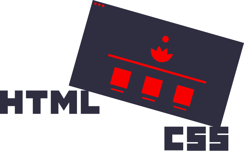
To create the main website page layout I used Adobe Photoshop and Adobe XD. Illustrator was used for creating the logo and the sandwich layers. The project was coded using HTML, CSS, and JS.